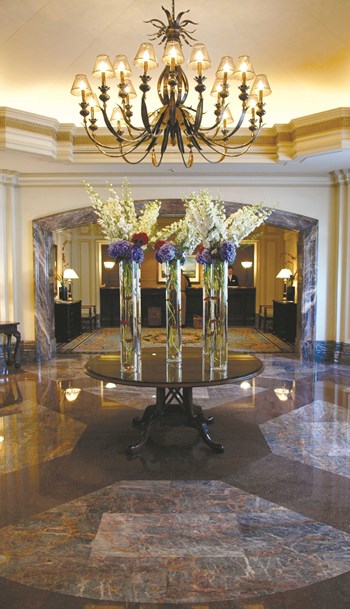
“Beauty is in the eye of the beholder.” “There’s no accounting for taste.” “One man’s trash is another man’s treasure.” While these age-old adages generally hold true, when it comes to working with design committees in co-op and condo spaces, there may actually be some hard-and-fast rules about what looks good and what doesn’t. Making sure everyone involved in the decision-making process understands these parameters can help avoid dissatisfied residents—and maybe a few faux brass light fixtures.
So what constitutes “good design?” Is it a certain color palette? Elements from a specific time-period? Post-modern minimalism?
Dan Jacoby, design director of interiors for Manhattan-based FX Fowle Architects, LLP, says it’s a lot more wide open than that. “First and foremost, good design is the sound application of basic principals relating to space, light, form and color,” he says. “Otherwise, we’re just talking about individual taste, which is personal, subjective, and related to the fashion of the moment. As long as taste is in the service of good design, then anything can work.”
Historically Designed
Making those tasteful choices and guiding the client to an end result they like is the primary job of the interior designer. These days, consulting with a designer is wise when considering the public areas of a residential building. Though most of an individual’s time is spent inside their individual apartment, first impressions made by their building’s lobby, hallways, and foyer are lasting ones that contribute greatly to the value of the property—both real and perceived. Throughout the years, interior designers have been helping people make those stunning impressions and adding value to their clients’ property.
“[Interior design] was first based on guilds with specialized tradesmen of a particular skill,” says Kim Depole of Kim Depole Design, a successful interior design firm in Soho featured on Oprah and the Style Network, among others. “Design went through a liberation just following the Victorian era. The industrial age and class liberation and the influence of so many cultures created the catalyst for change.”
No longer satisfied simply with attractive architecture outside, individuals wanted the inside spaces to be magnificent as well. Ornate rugs, chandeliers, carefully selected artwork, wall-coverings, and furniture were culled from the various cultures that entranced the affluent public and set the tone for countless interiors around the world.
But, as everyone knows, styles come and go, and interior design has adapted over the years as well. “Modernism afforded a new vision of space,” says Depole. “Interior designers served a very particular need in relationship to the architect—it was about the refining of the interior environment; a lifestyle change that to this day requires reeducating the way we live.”
Creativity and Compromise
It’s one thing for a designer to develop a fantastic design for a common area of a building. It’s something else altogether to see it carried out the way he or she envisioned it. The various conflicting opinions of board members, committee members, or meddling outsiders can make a designer’s job incredibly challenging. Not only are there aesthetic compromises to be made, the tools and materials a designer wants to used often have to be negotiated, too.
“In common areas, the choices designers have are much fewer because you have to please many people, not just one,” says Todd Schwartz of 13th Floor Design, a Towaco, New Jersey-based interior designer who executes most of his work himself and has been in the industry for over 19 years. “You have to try to pick something that works for as many people as possible. The other limiting factor is the quality or category of the goods you use. Residential goods probably won’t perform as well in common areas as commercial materials. You have to use commercial materials because of the amount of traffic that common areas get.”
The three major elements of a common area interior design are flooring, wall covering, and light fixtures. According to Schwartz, using commercial quality goods is crucial for cost-effectiveness—but that doesn’t mean sacrificing taste.
“You need resilient flooring because of all the heavy traffic,” he says. “Wall covering, without a doubt, has to fall into the Type II category, which means it has to be 20 oz. or greater—that means it has to be the thicker stuff. A lot of Type II wall covering looks so good these days, I’d put it in my own house. Just be careful, because some manufacturers have bent the rules to make it look that nice. If a wall covering is too smooth, it’s like semi-gloss paint—you can see every imperfection. A resident probably won’t get a sponge and wipe off a scuffmark they’ve made on the wall. If the building manager doesn’t do it either, the walls can get dirty very easily.”
And those compact fluorescent light bulbs everyone’s going green with? Those have long been the smart choice for interior designers working in common areas. “They’re low maintenance, energy-efficient, and lately have a much better lighting ‘temperature,’” says Schwartz. “Some people want incandescent bulbs, but you’ll change that bulb five times for every one you change the fluorescent.”
And if there’s one reason why commercial goods trump residential-grade goods for common area interior design, it’s that one: price. “The type of warranties in place for commercial goods exceed that of residential goods,” Schwartz adds. “A lot of people want to reinvent the wheel when they redesign their hallways—they want residential carpet or the incandescent light bulbs. But the maintenance cost is so much more.”
The Dark Ages
Just because style is subjective doesn’t mean there aren’t truly bad choices. Neon green and lavender make a fun combination for a week or so, but not for a decade. And if you’re planning a redesign of your building’s common areas, staying away from architectural changes is one of the cardinal rules followed by qualified interior designers. There was a day, not long ago, when colors ran rampant and architectural changes were made again and again: that day was somewhere in the morass known as the 1980s.
“The mid-to-late 1980’s—which some may recall as the Post-Modern period, but I will always refer to fondly as the Zolatone Years—were dreadful, in retrospect,” says Jacoby. “It was a time when everything was pink and teal, and those little square insets (sometimes in groups of four) popped up everywhere. To this day I can’t look square insets without feeling just a little bit guilty.”
Jacoby says that a lot of the design he’s replacing now in co-op and condo buildings was done in the 1980s, and that such project can sometimes become nightmares because previous designers and design committees often changed things architecturally— and not for the better.
“The designers in the ‘80s were more interested in putting goods in, but not putting them in properly,” says Schwartz. “The wall coverings and carpet in there today are hiding sins of the past. In the ‘80s, it wasn’t so much the color schemes—that can be changed easily—it was an installation and execution problem.”
Schwartz says he’s been doing a lot of damage control lately as well, due to a cable-happy public in the 1980s. “In the ‘70s and ‘80s, people were so excited to get cable TV in their buildings that the cable companies installed the cable however they could. They used plastic moldings and sometimes wires were visible, or the wires were all over the hallways. Now, some owners are going back to the cable companies and asking them to clean up their mess. The messy installation has created a huge problem for interior designers, and re-doing the molding can make up 25 to 30 percent of the overall cost of the project. But three out of three of my clients who have gone to the cable companies have gotten repairs.”
The Process
For most buildings, putting together an official design committee is the best way to get a plan in place and carry it out. Involving residents who have some background in architecture, design, or the visual arts can be helpful, but not necessary. Hiring a designer that your committee or point-person trusts will ensure that you’re in good hands, regardless of the knowledge base of the client. And when it comes time to see what the designer has come up with, don’t forget to listen.
“Talking clients out of doing something really awful is the greatest challenge a designer has to face, besides coming up with a sensational design in the first place,” Jacoby says. “However, if you have the client’s trust, and they value your opinion, then it’s a piece of cake. All you have to do is be honest but diplomatic with them and logically explain in a calm voice why they shouldn’t do that.”
Depole agrees, noting that a lot of her job is fielding the needs of the client. “It’s about guiding clients by providing more information,” she says. “They in turn can see that they need to reevaluate their choices. Design involves listening. Problem solving too, but listening is foremost.”
And when clients listen, the job can wind up costing less. “I try to help clients take advantage of procurement opportunities,” Schwartz says. “When you’re doing a big project, you can usually deal with high-level distributors and manufacturers, which saves money.” Schwartz adds that getting the opinions of other residents outside the actual committee can help defray complaints (and possible changes) later on.
“I recommend that buildings put out a survey to the residents asking them what their opinions are for the design of the lobby or hallway and why they think so,” he says. “Then, if a committee is put together and decisions are made with that input, it lets the steam out of any complaints that might occur. People can’t say they weren’t asked.”
A Fresh Coat of Paint
Whether you’re interested in a minimalist, post-post modern approach (think black onyx and beige) or something more colorful (orange is in this season,) as long as a design committee stays true to the basic tenants of good interior design, creative problem-solving can take place and look great. “There are no constraints in design,” says Depole. “The sky is the limit.”
Mary Fons is a freelance writer and a frequent contributor toThe Cooperator.


Leave a Comment