For the residents of a co-op or condo building, the building's lobby and common areas function much as a front porch or entry hall might in a single-family home; they're a spot to meet guests, get mail and packages, or to stop and chat with friends and neighbors. At least that's the idea. A successful common area’s style, comfort level and accessibility meets the needs and expectations of building residents; one that doesn't meet the mark is likely to be underused by residents—and maybe even avoided entirely.
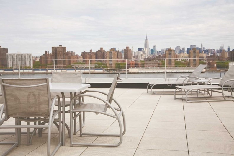
By definition, a common area is nearly any part of a multifamily building that's not owned by individual shareholders or unit owners—that could include spaces such as lobbies, hallways, recreation rooms, laundry and basement storage areas, courtyards, gardens, and fitness centers. Whether or not a common space is well utilized and enjoyed by residents depends upon the functionality, style and feeling of the space.
For example, a lobby is one of the first impressions a visitor has of a building, but an outdated, threadbare, or just plain poorly designed lobby can give an inaccurate impression of the building's inhabitants, or even reflect poorly on their commitment to its maintenance. So the question of what makes a common area a pleasant, inviting asset to a community, rather than a wasted space nobody spends time in, is definitely something for conscientious boards and managers to consider.
Defining Spaces
A common area—be it a lobby, community room, or outdoor space—can be considered successful when it is well-used and well-liked by residents. The building is their home, and they need to feel comfortable in it; decrepit décor and threadbare furnishings give an uncomfortable, downtrodden feeling, and a cold, institutional-looking lobby or entryway can be downright depressing.
That being said, a condo or co-op's lobby should not feel too comfortable—it's not a living room, after all—but it should feel transitional as well as being attractive, says Marjorie Hilton, owner of Marjorie Hilton Interiors in Manhattan. “People ultimately need a place to sit, even if it’s for a moment. Successful [common spaces] have a spot to sit comfortably for five or 10 minutes.”
Because of these and other considerations, a successful common space begins with collaboration between a building’s interior designer, the board and its decorating committee. In order for the joint venture to be successful, the committee needs to decide on and express their wishes and vision clearly, says Liz Morehouse, owner of Morehouse Design Associates Inc. in Manhattan. With the committee’s input, the design team will be able to work together to create a space that will be well-used and in which people will feel comfortable.
Marilyn Sygrove of Sygrove Associates Design Group Inc. in Manhattan. agrees. "When you're dealing with a co-op or a condo board, you're dealing with a group. Initially, you have to get some sense of what the demographics are at the building and what they think. We do that through a survey where we ask very specific questions about preferences. Do you want [a] design that has modern accents? Do you want it to have traditional accents, or do you want it to reflect the [historic] period of the building? We ask about color preferences and so forth. The information on the survey enables us to get a consensus, and then we proceed with design. Everybody has a personality, and they all have an opinion. It's the job of the designer to bring consensus, and we know we're not going to make everyone happy, but when we have more information, we're able to be more successful."
Co-op and condo buildings can rejuvenate an unappealing common area into a space that's loved and used by residents by addressing basic design elements such as arrangement and style of furniture, use of color, and lighting. One of the simplest factors in whether a common area is welcoming or not is its layout, says Hilton. When a board or property manager is re-visioning a communal space, keeping the plan simple can help. “I think what makes you feel comfortable is uncluttered space—clean and neat and beautiful,” Hilton says. “It makes you proud that you live there.”
De-cluttering a space and rearranging furniture is a very easy, inexpensive way to encourage people to spend more time there. Grouping sofas and chairs into pairs or semi-circles doesn't cost a cent, and can foster a more convivial, welcoming atmosphere in a lobby or common room.
For Warren Heit, owner of Mt. Vernon-based S & W Painting, a successful common area has a pleasing color scheme—but it doesn't stop there. It also includes other elements of the room, such as moldings, window treatments, and furnishings. “The colors should be in sync with each other,” Heit says. “In a successful common area, all of the colors and motifs will blend together for a nice aesthetic finish.”
Like many designers, Heit recommends using earth tones in common spaces and hallways. For long hallways, he recommends cozy colors like cocoa and warm, olive greens. He advises boards and managers of buildings to hire an interior designer to help them with improvements to common areas. “A good designer will give you different ideas and options of what you can do,” Heit says.
Of course, even the most inviting, eye-pleasing color scheme is a lost cause if it's not lit properly. According to Hilton, successful common areas are bright and well-lit, but not overly illuminated. Atmospheric lighting options are available to create the right ambiance for any space at any price.
The process of devising the right design plan for a common area is partly about finding a happy medium that's palatable for most residents. Design questions are a matter of taste, so not everyone will agree on choices made in renovation projects, but consensus should always be the goal for boards and their design professionals.
“When the board or property manager is looking for opinions, they should remember that common areas are not individual apartments,” says Sivan Mair, co-owner of Art & Interiors, an interior design firm in Woodbury. “You want it to be comfortable for most people in the building.”
Rejuvenating Looks
Of course, the practicality of a common area has to be taken into consideration when remodeling it, Mair says. Before beginning any project, most designers and decorators will sit down with building administrators, as well as its security guards and porters, to devise the best plan for what materials should be used in the remodeling work. “If the employees need a certain type of flooring because it’s practical to clean, we’ll bring that into consideration,” says Mair.
Design pros agree that done right, the updating of a building's common space can only add value to the building as a whole. While full remodelings of a building’s community spaces are only done every 15 to 20 years on average, Hilton says, boards often become complacent in the meantime, and don’t take decisive steps to refresh their spaces until it is long overdue, usually citing cost as the reason for letting things go another year.
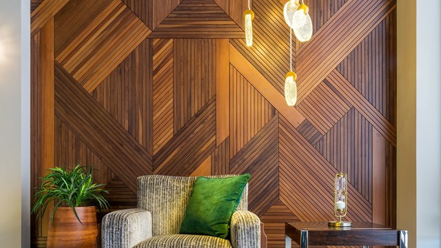
Value-adding upgrades needn’t be prohibitively expensive, though. Dramatic effects can often be achieved easily and at relatively low cost. Simple moves such as changing the color of paint on the walls, or changing the angle of a rug or sofa in a common area can make a big change in the feel of the space. Adding plants and planters in a common area and changing the wall covering from a plain, off-white paint to a warm gold, or even a richly-textured grass-cloth material can brighten it a great deal, Morehouse says.
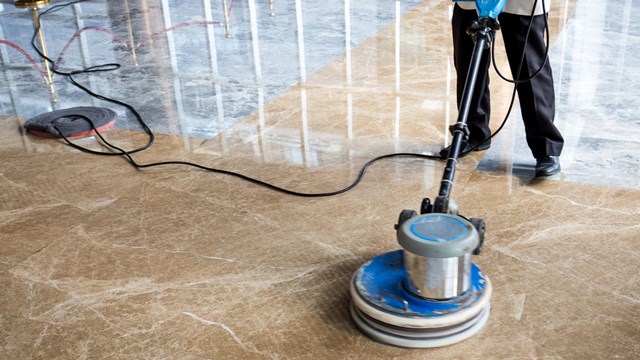
"I'm a big believer in ambient light instead of direct light," adds Sygrove, "which means table lamps, sconces, combinations of lighting rather just one flat light source. We like to make sure there is a variety of lighting. And we always find that neutral colors are almost always accepted. Same goes for natural materials—meaning wood, stone, those types of materials. Or consider really small things like lampshades—change the lampshades, or simply rearrange the furniture. Sometimes editing out some of the furniture and making a small investment in one focal piece will give a lobby a completely different look. So there are lots of ways to do it on a limited budget. It just has to be very closely monitored and edited appropriately. And don't underestimate the impact of a good, deep cleaning. Often buildings that don't have a big budget will let things go, but just by having the floor polished, all of a sudden the building is new and fresh and alive. So those kinds of things definitely count."
For one communal area Morehouse recently worked on, a tan-and-black St. Laurent marble was installed, replacing a white terrazzo floor dating from the 1960s that looked dated and institutional. In another client’s common area, rather than placing a traditional Oriental rug in the lobby space, Morehouse suggested a Tibetan rug and more contemporary lighting fixtures to update the space without making drastic changes.
Morehouse also recommends buying lobby and hallway furniture from less expensive catalogs to further cut renovation costs. “You can make a space look great, even on a budget. A good designer can pull it off for you,” she says.
Hallways are common spaces that can be boring and dreary if their design details aren’t properly chosen, Morehouse continues. Finding a carpet with an interesting pattern for the hallway is a good first step. “I also use wall coverings that look like linen and silk and that are interesting colors,” she says, “and I use a different wall covering [than the lobby] for the elevator.”
These days, understated wall and ceiling treatments and the right decorative lights can make a huge difference in a common area. Adding “uplighting” to foliage in an outdoor space is one way to bring it to life, says Tina Tilzer, an interior designer who founded Art & Interiors. Her firm also uses a lot of chenille fabrics, as well as easy-to-clean leather and vinyl furniture in indoor common areas such as lobbies, which also are good places for placing a framed mirror as an accent. Adding base molding or crown molding are fairly inexpensive changes that can help to clean up the space, she continues. Also, reupholstering existing furniture, rather than replacing it with new pieces can also save a great deal of money.
“I find that boards really want quality,” Tilzer says. “With a lower project budget, we can do things like using signage companies that take away old bulletin boards and signs, then put in new signs and tweak everything in the lobby to just make it fresher.”
In tough economic times, the state of a building's lobby furniture or the angle of the entry hall rug might seem like trivial concerns, but the fact is that appearances do count—particularly in a recessed market where buyers can afford to be choosy, and where residents themselves may be going through a rough patch. Making an investment—even a modest one—in making your building's common areas more inviting is one way to raise both values and morale.
After all, says Hilton, “You have to love where you live—because sometimes you’re stuck there.”
Jonathan Barnes is a freelance writer for The Cooperator and other publications.


2 Comments
Leave a Comment