When remodeling the interior of multifamily buildings and HOAs, boards or board-appointed committees might be tempted to adopt an “out with the old, in with new” approach. Others prefer to stick to “tried and true” designs to suit their aesthetic preference. But the best approach recognizes that interior design can enhance the quality of life of your community. Combining this season’s styles with pragmatic principles and clear goals is key to creating a trendy and warm atmosphere that serves your community.
Classic Color & Texture Therapy
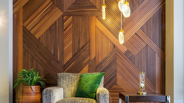
The contemporary ‘wellness’ movement has spread from the vitamin aisle and Instagram feeds to interior design. Calm, soothing colors and natural materials are helping people cope with both the hectic nature of modern life and the upheaval caused by the ongoing coronavirus pandemic. “Natural textures are still really popular,” says Elizabeth Sanchez Vaughan, principal of In-Site Interior Design, a multidisciplinary interior and architectural firm in New York City. “The world is so demanding and crazy and difficult that people want a space that they can go into and just relax. So things like woven wood, and natural [and] textured stone, are really still popular. I’m still seeing very calming palettes, neutrals as far as color palettes. It’s kind of an either/or. You’ll see the color pops, or you’ll get the neutrals making things very Zen.”
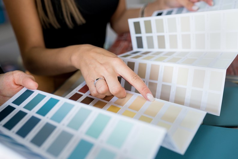
Updating your building’s color scheme doesn’t necessarily mean selecting from the newest of the new color swatches or trends. Kevin McGowan, a principal of Forbes-Ergas Design Associates in Manhattan, describes recent remodel projects where some classic principles of color selection for common areas still reign. “Thirty years ago, the popular thing was to do color on the walls. Twenty years ago, a lot of buildings would have terracotta-colored or blue or green wall covering. These days, people totally want to get away from that—they want the walls to be light and bright,” he says.
That means “neutrals such as beige or gray,” which McGowan refers to as ‘New York neutral,’ “with pops of classic blues are the most sought-after shades. I’m finding people are getting into a lot of green tones lately. Again, those greens are the rich tones; they’re certainly not vibrant green tones.”
Accents & Furnishings
One of this year’s trends includes custom wall art to reflect dreamy city imagery and create the impression of a window on a wall where there isn’t one. “Lobbies are more into art lately,” says McGowan. “We’ve been getting a lot of clients who are interested in commissioned pieces. We did a lobby where they wanted the art to reflect New York City, but they didn’t want photographs. Around that time, my partner Karen and I were in Montreal, walking down the street, and we saw a gallery. Lo and behold, there was this art that was just so amazing. We talked to the artist, and ultimately commissioned a piece by him for the lobby. It’s just so beautiful; it has vibes of New York City, but abstract buildings. I’m really excited that clients have gotten into commissioning pieces to fit the needs of their buildings.”
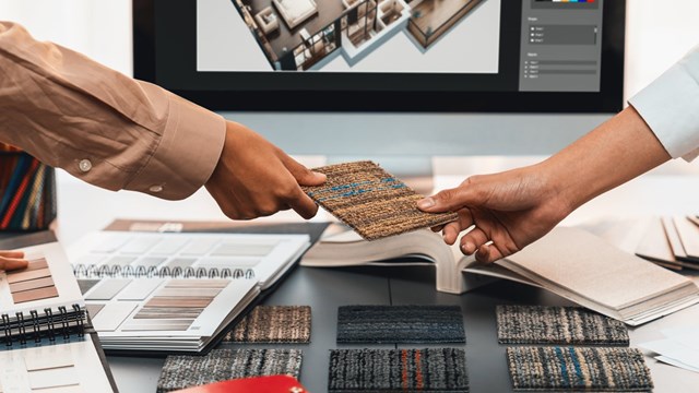
Other buildings are undertaking more significant remodels to replace obsolete flooring with appealing yet practical furnishings. Jonathan Baron, a New York State-certified interior designer who works with multifamily, cooperative, and condominium buildings, points out this season as a good time for finding attractive and reasonably priced solutions to replace old tile in high-traffic areas like hallways and lobbies. “Perhaps the buildings were built in the 1950s or 60s, and they may have asbestos or vinyl tiles,” he says. “An excellent solution is nylon carpet, and there are several reasons why.” Among the top reasons he cites are durability and simplicity of maintenance. “Nylon carpet picks up dirt that can potentially build up in a hallway, and once a week, they vacuum the carpet. With a vinyl floor, the maintenance would require a wet mop, which takes more time and more energy [than simply vacuuming].”
According to Vaughan, “In terms of lounges and [furniture], there are some beautiful things out on the market right now. Chaises are back, for example; swivel chairs are back. There’s fun and classic resin—cool stuff. We’re also doing a lot of ottomans and poufs, which can be really fun because they’re so flexible. You can bring them over to different seating groups or spaces. There are some beautiful woven fabric poufs that are on the market now; they’re fabulous.” The presence of fun and whimsical accent furniture signals a sign of the times. “I feel it kind of spans generations,” says Vaughan. “Generations are changing. Buildings generally are always changing as new folks come in.”
New Lifestyles Create New Needs
Thanks to the pandemic, multifamily residential life has changed—especially with respect to mutual safety and quality of life. Design and installation professionals who understand a community’s wants and needs relative to the ‘new normal’ can help make stylish and lasting choices applicable to a post-COVID lifestyle.
For example, “One thing we’ve seen is people wanting to get away from having too much seating in their lobbies,” says McGowan. “They don’t want people congregating. When we do a lobby design, many [clients] want us to limit the amount of seating compared to what they traditionally had. If it’s a lobby with seating for eight, they maybe want to reduce it to four.” These seating changes require no additional alterations to compensate for the removal of furniture, he adds. “These lobbies tend not to be very big,” McGowan says, “and the reality is that the lobby should have never had seating for eight in the first place. It was crammed with seating.” So in addition to being more COVID-conscious, “it’s smart to reduce the seating, because then the lobby looks more balanced.”
The pandemic also underscored how digital habits influence our day-to-day lifestyles, deepening our reliance on e-commerce and delivery services. According to Baron, “Recent upgrades to common areas include doorman packaging and package holding stations to accommodate the volume of multiple packages daily. The real challenge is to create a space accessible to FedEx and Amazon, and keep sensitive items such as medication, grocery, rented equipment, and fragile deliveries in safe storage.”
Our almost-everything-is-digital lifestyles also influence the elements designers consider when approaching a remodel. “It’s important to realize that we’re focusing on a digital world,” says Vaughan. “When we’re doing amenity spaces, we’re thinking about things like how to make ‘therapy areas’ for having a private conversation; backdrops that look good on Zoom, or maybe areas or vignettes for an Instagram selfie. The digital world has made a big impact, and the pandemic specifically has made it so, because people were at home. Amenity spaces became extra living spaces. We’re creating areas to serve as ‘business lounges’ as I call them; spaces where people can work with their laptops and feel comfortable doing so, with some visual and audio quiet, and a little bit of privacy. The amenity space has gotten more use than anything during the pandemic.”
Finding the Right Theme
There is no “one size fits all” when deciding on an aesthetic theme for communal and multifunctional spaces. It just takes the right proportion of vision and planning. That said, boards and their design professionals should always consider the bones of the building. “Employ the natural style of the architectural style of the building,” advises Baron. “Suppose it’s a mid-century modernist building. It needs to reflect mid-century modern development. If it’s a 1920s/1930s Art Deco building, I believe it needs to reflect that style—like it would be classical with crown molding. If it’s a new building [built] in the last 15 to 20 years, which would most likely be modern, it would have a contemporary style. My work is contextual; it’s thematic. Therefore, the cooperative or condominium’s investment would be a wise, long-lasting one.”
While prudent boards and HOAs may like a longer-lasting design, no design lasts forever. To keep your common areas vibrant and current, Vaughan suggests a periodic spruce-up. “Yearly or every two years, they can change accessories out, change the art. It’s not a major investment like adding furniture or changing furniture, but small things that change can make a difference.” Vaughan describes her approach to finding suitable themes as providing options so boards can exercise choice. “We usually come with two schemes,” says Vaughan. “The first is the one that we’re excited about. We know it’s great for the building in terms of its personality and goals. Then we’ll have a second scheme, [ …] and maybe there are elements of that second scheme that the residents might appreciate more.”
Project Management & Planning
Realistic future planning can alleviate the pressure to choose a relevant and reasonably timeless design. “Buildings should consider changing their design every seven to 10 years,” says Vaughan. “You’re [not] looking for something that will last 30 years. We’re going to go through trends, and the reality is that amenity furniture gets beat up and worn. To keep things looking fresh, there needs to be continual upgrading. In terms of design, we want something that’s not quite classic in the traditional sense, but more like clean lines contemporary without being over the top.”
When it’s time to begin planning a remodel, your design professional can be a board or committee’s best resource for where to start. “I start the project by providing an overall budget,” says Baron. “I can draw together a budget because of my resources and figure out a design solution.”
When choosing a new interior design, there are several elements at play. While it may seem chaotic, the process can reflect the result. Boards and HOAs might find rest in knowing that they are not alone in making the choices that enrich their communities and then spend time in a newly designed, serene amenity space to congratulate a job well done.
Melissa Swinea is a freelance writer and contributor to CooperatorNews.





Comments
Leave a Comment