Real estate in the Big Apple like any large metropolis is expensive, and that often means making due with a small apartment. Small spaces present many functional and aesthetic problems—lack of storage, oppressive walls, etc. Fortunately, with a few design tricks from the experts, tenants can make their apartments cozy instead of cramped and even create the illusion that a space is larger that it really is.
Light and Space
Marjorie Hilton, of Marjorie Hilton Interiors in Manhattan, calls lighting the “stepchild of design.” According to the New York City-based designer, the most important function of an apartment, large or small, is that it gives you a positive feeling as soon as you walk in the door. “Even if you have no furniture, nothing, my money would go into lighting,” Hilton says. “The best lighting scenarios are a combination of things.”
There are three types of lighting in any good design scheme: general overhead, ambient and task. Overhead is your primary source of lighting, whereas ambient is used to set a mood. Task lighting, on the other hand, serves a concrete function, i.e. reading lamps, kitchen stove lights, etc.
For overhead and ambient lighting, Hilton claims to have had a great deal of success with track lighting in large part because it can light a room without taking up any floor or wall space. During cocktail parties, you can pull down the dimmer switch for a softer finish to the room.
Asked to give an example of a project she recently completed, Hilton says, “I used track lighting on the ceiling, and put little MR16 lights on the track.” MR16 bulbs deliver low intensity directional lighting. “You turned on the track and it was like little twinkle toes. You didn’t really need any other illumination.” She calls the track lighting “a very wise expenditure,” since it did exactly what you would want in a small apartment: provided great light while staying out of the way.
For Rebecca Alston of the Manhattan design firm Rebecca Alston, Inc., the best lighting schemes take into account not only the needs of the tenants but also the needs of the room based on the amount of natural sunlight. “If you have no views and your windows are facing an alley,” Alston says, “I would put up a very sheer window treatment and behind it an ambient light so that when the window treatment is closed you feel like there is light penetrating from the exterior. Psychologically, you’re creating sunlight.” She says it’s important for a designer to see an apartment both at night and during the day to evaluate the natural conditions properly.
In a small apartment, task lighting needn’t be a major expenditure. For young shareholders on a tight budget, Hilton recommends at least two lamps by the couch. The resident “has to either flank the sofa with two side tables and two lamps—one that is an adequate reading light and the other that just gives ambient light—or, one side table with a reading lamp and the other table with a floor lamp.”
These are touches that can increase the functionality of a given area and therefore make a space feel larger. Even if, say, a floor lamp seems to take up a great deal of physical space, it’s worth asking yourself whether or not the piece makes up for its size with purpose.
Colors and Mirrors
Color, light and space all affect the perception of one another and, therefore, must be considered as a whole. “If you have brilliant daylight, it doesn’t matter if your walls are navy blue, you can live with it because you have such an expansion of light and space,” Alston says. “But if you have a poorly-lit situation, you have to go with colors that recede. In a particularly small space, whether you have direct light or not, you need a color that recedes.”
The common belief is that white walls are the universal remedy for claustrophobia inducing spaces, and they are an obvious solution, though not the only one. In fact, there are number of creative ways to decorate a room without resorting to basic white.
“If you take a warm color and gray it down and add light,” Alston says, “chances are the color is going to recede. To not have a boring environment, you could take one small wall on the linear access, and you could put an accent color. You want colors that reflect your light and don’t absorb it. It’ll add a lot of spark to the space.” This splash of color should appear on a transitional wall, she says.
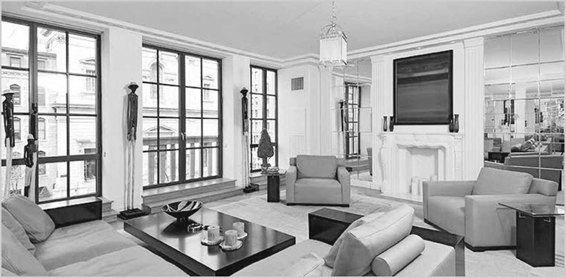
Mirrors are another great way to create the illusion of a more expansive space, as well as maximize whatever light you have at your disposal. Mirrors, of course, reflect light, which means they need to be set up with careful attention paid to your lighting scheme.
“Usually you want your mirror across from your window wall,” say Jackie Torres, a senior designer with Ruby, a Manhattan interior design firm specializing in small projects and finite budgets. “Your darkest wall is going to be where your windows are, and your lightest wall is going to be opposite it. The mirrors help bounce around the light as it comes in.”
Alston also suggests using mirrors to create the illusion of more space in an area that feels particularly closed in—over the entrance table, for instance. Emphasizing their utility, she normally insists on a full-panel mirror someplace in the bathroom, if only because it allows you to complete your entire dressing ritual in a single space. “The bathroom is a functioning space,” she says, and it should be treated as such, with great attention paid to mirrors and lighting. Nevertheless, she cautions designers and homeowners not to get too carried away with the placement of mirrors—there’s a fine line, she says. “I recommend selective use of mirrors, because in the ‘80s, people would go in and plaster walls and ceilings with mirrors.” That’s a “look,” Alston concedes, but not one most people would want to bring into the 21st century.
Improving Circulation
Circulation should be a priority in any design scheme, especially in a small room or apartment. According to Alston, “You can lose a large portion of a space if it is laid out incorrectly.” Bad circulation, to be sure, makes a space hard to live in and even harder to entertain.
Alston recommends multi-use storage units that stretch to the ceiling, adding, “You want to avoid any kind of cumbersome design. Whether you have it built custom by a woodworker or you go to the container store and buy acrylic units, the critical issue is where it is located, so you’re not constantly chasing something.”
You can apply that same rationale to pieces like couches and tables. “Just make it [dually] functional,” Alston says. “A cocktail table—you can break into three end tables. Furniture on casters. Or you may have a desk you can flip up against the wall, so you don’t have to have it open when you entertain.”
Hilton, agreeing with the idea of dual functionality, even suggests using bookshelves to cordon off an area of a studio apartment for sleeping privacy.
While every designer has a slightly, if not dramatically, different approach to dealing with small spaces, all seem to agree that basic organization is fundamental to making the space work. That can mean investing in a custom closets, yes—but it is also as simple as fighting pack-rat tendencies and tidying up your electrical wires
One idea proposed by Maxwell Gillingham-Ryan, author of Apartment Therapy: The Eight-Step Home Cure, is to simply get rid of all your old CDs. Chances are you already listen to most of your music on a computer or i-Pod, so why not transfer the rest of it to your hard drive and get rid of those boxes of CDs? To that end, Alston suggests installing electric outlets directly where they’re needed “so you’re not dragging cables all over the place.” And make sure you’re keeping your closets well organized.
If these sorts of details are important in a large apartment, they’re essential in a small one. Indeed, nothing makes an apartment feel cramped like a harried morning during which you trip over an electrical cord while looking for your favorite T-shirt.
“If you’re a collector, collect miniatures,” says Alston jokingly. But she makes a great point. Living in a small apartment may require some lifestyle changes, but if your space is designed properly, they should never feel like sacrifices.
Jonathan Levin is a freelance writer and copy editor living in Philadelphia, Pennsylvania.


Leave a Comment